The only thing that I don’t really like about the current UI is the lack of buff indicators. Currently, as far as I can tell there’s no real way to know when you passive buffs have proc’d. Add in some buff icons and I’d be happy with how things are now.
I would really appreciate if the new UI would position the health/mana/skills part centered at the bottom instead of the bottom left corner. My main reason for this is that I’m playing on Ultrawide (21:9) and the position in the corner moves the health globe so far to the border of my peripheral vision that it’s hard to get the single most important visual clue in time: when my health get’s low and I’m about to die.
If that’s not going to make it into your default layout, please consider adding an option for it!
Otherwise I very much like the style of the new UI preview, even though it’s really more of a teaser and we don’t see very much yet.
Thanks for the feedback!
I’m not sure if that would make it easier to notice, but I’ll definitely bring this up internally.
This is something we’ll definitely be implementing, regardless of the aesthetics of our user interface. It’s just an example of work we haven’t quite gotten around to just yet.
It’s looking good! I’m loving the proposed changes.
One thing that I would suggest is to alter the way potions are presented. At this time, they easily blend in with the overall HP globe.
I’m also in agreeance with the others on the way the Ward is currently implemented. Having it so far to the left it is often forgotten about or maybe not even discovered by a new player until later. I know I spend quite some time playing without even noticing it.
As for capturing the dark, gritty atmosphere. I think this is subjective and can be different from person to person. Diablo 3 and PoE are both considered “dark and gritty” but they have vastly different art styles and gameplay elements. Last Epoch needs to reflect on the overall theme of timelines, etc and leverage that to create their own version and dark and gritty.
Great example Sarno! Loving the work so far!
Pretty sure most people don’t think D3 is “dark and gritty” hence the call for D4 art style to change closer in alignment to D1/2.
Oh you would be very surprised. New age fans who aren’t familiar with Diablo 2 because it “looks bad” lean towards Diablo 3 as their first hack n slash and since they always heard Diablo is a dark game, they assume D3 is too.
Do I agree? Not really. But the general consensus is what it is and I would love to see an ultra dark game. Brutal, gritty and disturbing.
Heavily agree. Any serious ARPG fan doesn’t think D3 is dark and gritty.
Path of Exile has fairly dark and gritty graphics, but also storyline.
Some good examples of Path of Exile’s atmosphere being dark are all the stories that you can discover if you just go look for them - Piety did human experimentation - Atziri abducted her own citizens to sacrifice them - Karui are cannibals. I really approve of that kind of storytelling, both in style and subject matters.
As i already mentioned on discord it would be good if we could scale the UI in the Options (still haven’t checked if that’s already in).
I agree with the others that the ward needs some better visualization.
An Option to change where the Health Globe is located would also be nice.
And as a suggestion, maybe you could add different UI themes, i would like the idea that the UI changes based on the Timeline you are in, like giving it a more greenish look in Ancient Era, a more militaristic look in Warring Gods Era, A Dark/Undead Looking theme in Undead Empire Era, and a Purple/corrupted look in Ruined Era (Can be changed in Options).
So far I really like the changes you shown us, and i am looking forward to whats awaits us on this games journey.
Keep up the good work.
Some random comments about the UI after spending several hours playing in the last few days:
- As previously mentioned, having the potion in a different color from health would make it stand out more easily.
- I agree that shield is easily lost in the shuffle visually.
- Have you given any thought to allowing the user to reposition the control bar as a unit via drag and drop, ala World of Warcraft? Even if it is only repositionable along the X axis, that would be a benefit.
- I really wish there were options to increase/decrease the size and color of the cursor. On 3K and 4K displays when running at full resolution, the cursor gets lost, especially when there is a lot of combat going on. I can’t tell where the heck I’m clicking. The antique look of the cursor, while cool, doesn’t have enough contrast to easily spot it in the fray. For those of us on the upside of 50, whose eyesight may not be the greatest (or those with accessibility issues), the ability to adjust size and color of various UI components would be a boon. I realize that’s a tall order.
- Is the map overlay (Tab) going to be zoomable (both in and out) or pannable at some point? Right now it’s of minimal use, IMO.
Those complaints aside, the graphics and functionality have increased greatly since Kickstarter. It’s wonderful to see all of the progress… unlike a certain game that I backed which shall remain nameless, that has been in “beta” (really alpha) for approaching a decade.
Much better, keep up the good work! Are there any updates to the item sheet?
A suggestion I would have for the UI of summons, would be the option to add a toggle to either the skill bar showing how many summons are active or have the top left summoned/buff indicators show when the ability can be used again. Another option would be to allow static positioning of summons icon on the top left corner so you can more quickly assess what summons are present in your roster of minions. When playing on a large screen it is difficult to have to glance at two different corners of the screens while managing combat to see if the summon is either active or at maximum count or whether you can summon again without just needlessly replacing an already present minion.
This looks amazing, i love what you did with the UI!
Next is a bar for the buffs and the minions 
If everything gets this much better in that short amount of time then this game will be HUGE.
Keep up your great work, i love seeing your work.
Thank you very much for the centered main UI (health/mana/skills)!
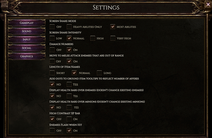
Everything looks very nice now. Also the settings themselves look very interesting and helpful (especially move to attack and and affix dots).
This looks amazing. Can’t wait for the new update!
Oh definitely, please. When using Torch of the Pontifex, I’ve filled my entire screen several times when I pop a pack. Even just having a counter of total minions of that type would be nice
Good Stuff!
I noticed that images 1, 3, and 4 in post #18 were 404ing.
I’ve restored them, though I can’t say for certain whether they are still in their original order.
Here are some of my opinions for the UI:
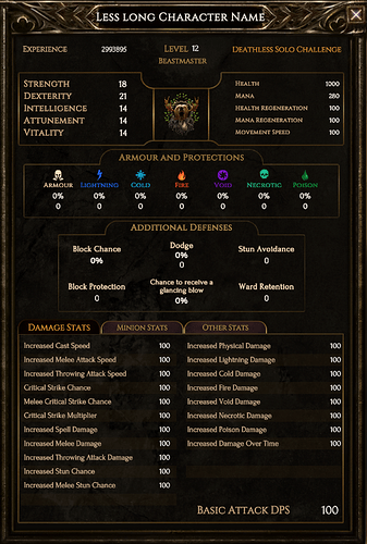
Character Sheet:
I think this is fine and shows things clearly. My personal Quality-of-Life (QoL) thoughts for reducing clutter and make things a little more obvious would be having what is shown either:
- Customizable
- Display those stats modified by gear/items/passives/etc.
- Keeping the standard defense stats
Shield / Health / Action Bar / Mana
This default look is fine, and reminds of the many other ARPGs that I have played. Some of my suggestions are:
- For wider displays: have this placed in the center of the screen by default
- Give an option for no fluff/fancy borders
- Nice-to-Haves (NtH):
- Drag-and-drop anywhere on screen (include a reset option)
- Either as a whole or individual parts/groups
- Size scale for this part of the UI
- Limited scripting API so users can make other renditions
- I’m partial to LUA as I would definitely change this to be more action oriented, meaning:
- Buttons at bottom of screen with hotkeys inside the button, not underneath
- Shield/Health/Mana as a smaller, combined to a single grouping, and located near the character
- I’m partial to LUA as I would definitely change this to be more action oriented, meaning:
- Drag-and-drop anywhere on screen (include a reset option)
Menu Buttons
They look nicer than they originally did but still think they seem a little odd. He’s what I’m not keen on:
- Metal button border (MBB) lights up with mouse over and darkens with mouse down.
- Would think the purple [albeit matte] gemstone (PGB) is the ‘button’ portion and it just doesn’t seem correct
- The default button lighting does not match between the PGB portion and the MBB
- PGB light source is from top-center
- With a top-center light source coming from a point:
- Horizontally centered
- In front of
- Vertically above
- With a top-center light source coming from a point:
- MBB light source is from direct-center
- With a direct-center light source coming from a point:
- Horizontally centered
- In front of
- Vertically centered
- With a direct-center light source coming from a point:
- PGB light source is from top-center
- Reverting to the default color for button press is so 90’s
I do have suggestions to fix this haphazard button! The simplest solution would be to change the light source to be the same for both the MBB and the PGB (either direct-center OR top-center). And only light up the PGB not the MBB with mouse over.
For a slightly more complex but better looking solution, I will break this into 3 states:
- Default Button
- MBB
- Keep the current, even with it’s direct-center light source
- PGB
- Change the material from matte to be a little glossier: think gemstone just don’t go full gloss since I understand dark-n-gritty is what your going for
- Keep the current semi-translucent effect
- Change the light source to be direct-center but with an intensity more akin the the MBB
- MBB
- Mouse Over Button
- MBB
- Change to a purple light source that is at the gemstone’s true-center
- The shadow on the left/right sides should get illuminated by this as opposed to a similar direct-center light source
- Change to a purple light source that is at the gemstone’s true-center
- PGB
- Add a purple light source in the true-center of the gemstone
- aka, the new light source for the above MBB
- Add a purple light source in the true-center of the gemstone
- MBB
- Mouse Down Button
- MBB & PGB
- Reduce the purple light source down to 25-50% intensity of the Mouse Over state.
- MBB & PGB
To clarify the true-center is a light source coming from a point
- Horizontally centered
- Inside the gemstone
- Vertically centered
For bonus points, on the slightly more complex button suggestion, have the light source not be simply static but follow the mouse relative to the gemstone.
If this makes no sense I’m sure I could whip up a WPF example.


